Planning
How do people decide whether they have capacity for another commitment?
TEMPO · PERSONAL ENERGY PLANNER
THE CHALLENGE
A packed schedule can feel overwhelming even when there is technically enough time for everything. Work meetings, social plans, focused tasks, and personal commitments each affect people differently—and recovery looks different for everyone.
Some people recharge through social connection, while others regain energy through solitude and personal time. Most scheduling tools treat these activities equally, leaving users to figure out for themselves when they are taking on too much or when they need time to recover.
What if your calendar could understand not only when you’re available, but also how your energy changes throughout the week?
USER RESEARCH
I focused on busy students and working professionals aged 18–35 whose weeks combine work, study, social commitments, personal responsibilities, and downtime. The audience was defined by a shared behavior: regularly managing competing demands on their time.
How do people decide whether they have capacity for another commitment?
Which activities tend to consume or restore their energy?
How do different people recover after demanding work or social activities?
When do people realize they have overcommitted themselves?
RESEARCH METHOD
I used open-ended questions about recent weeks, scheduling decisions, moments of exhaustion, canceled plans, and recovery habits. I avoided introducing the idea of an “energy planner” early so the conversations could reveal existing behaviors before suggesting a solution.
How do you usually plan your week?
When does a day start to feel too busy?
Does free time on your calendar always feel truly available?
Which activities drain you, and which help you recharge?
When do you realize you have scheduled too much?
THE SOLUTION
Tempo helps people reflect on how plans affect their energy, spot draining patterns across the week, and make room to recharge in the way that works for them.
USER FLOW · FROM SCHEDULE TO PRESSURE
Tempo is designed for people whose schedules are already full. The experience begins by connecting an existing calendar, then adds a personal energy layer to the events that are already there. The goal is to turn a schedule from a list of commitments into a clearer picture of how demanding the day and week may actually feel.
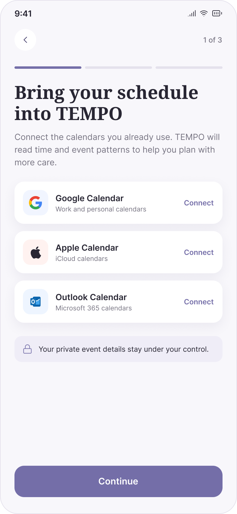
Users can bring in Google Calendar, Apple Calendar, or Outlook. Tempo reads the time and event structure they already use, reducing the setup burden for people who are already managing busy schedules.
Design detail Calendar connection happens at the beginning of onboarding, while a privacy message makes the data relationship visible before users continue.
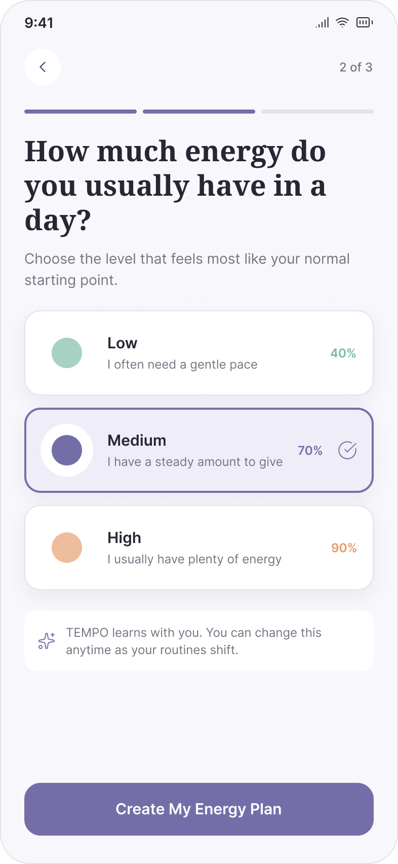
Before Tempo interprets the calendar, users establish a simple energy baseline. This gives the system a personal starting point instead of assuming that everyone has the same capacity.
Design detail Low, Medium, and High are framed in everyday language. The baseline can change as routines shift, keeping the model flexible rather than treating the first answer as permanent.
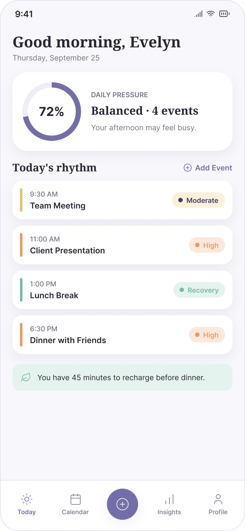
A one-hour presentation may demand more energy than a longer lunch break. Tempo translates existing events into Moderate, High, or Recovery moments and summarizes the combined demand as Daily Pressure.
Design detail The 72% pressure score gives users one immediate signal, while event-level labels explain where that pressure comes from. Recovery appears in the same hierarchy as meetings and social plans.
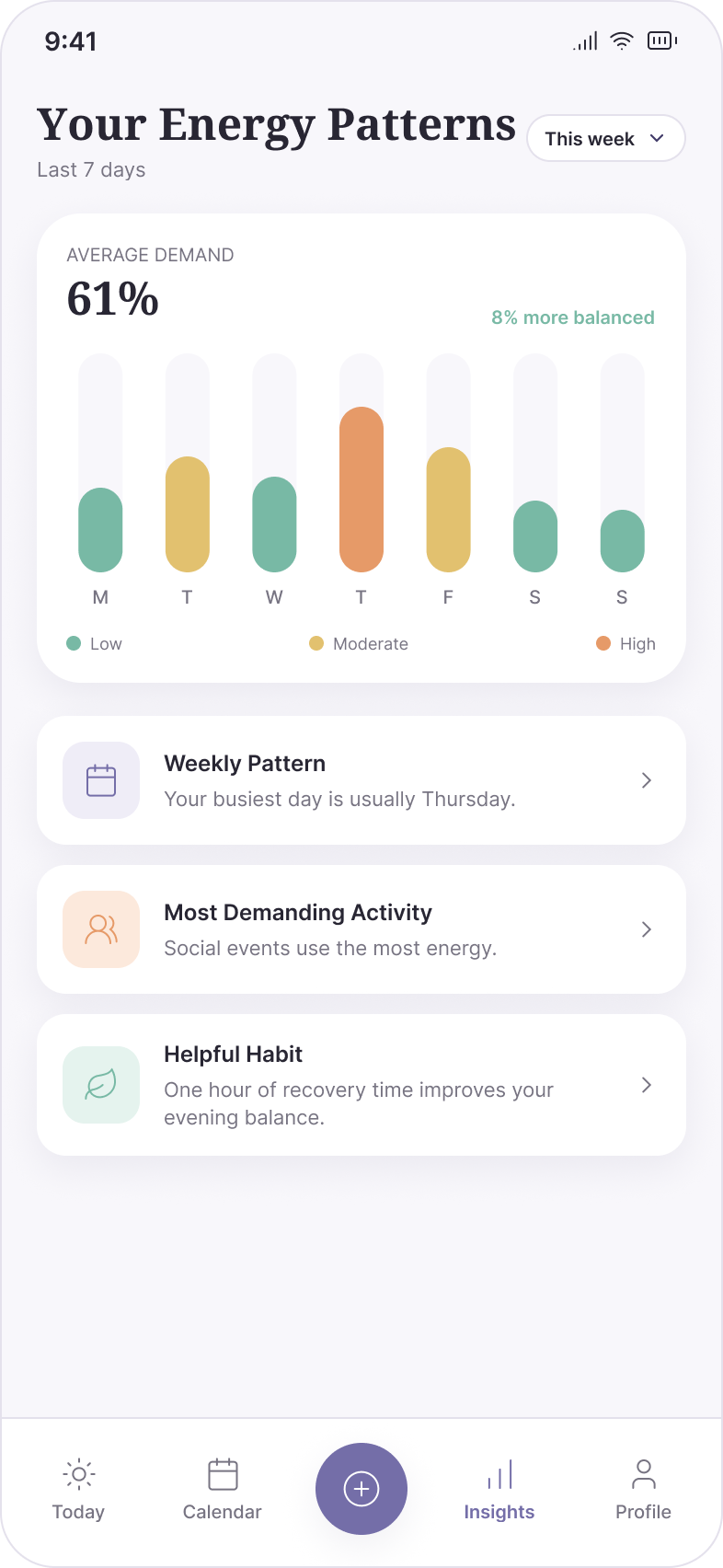
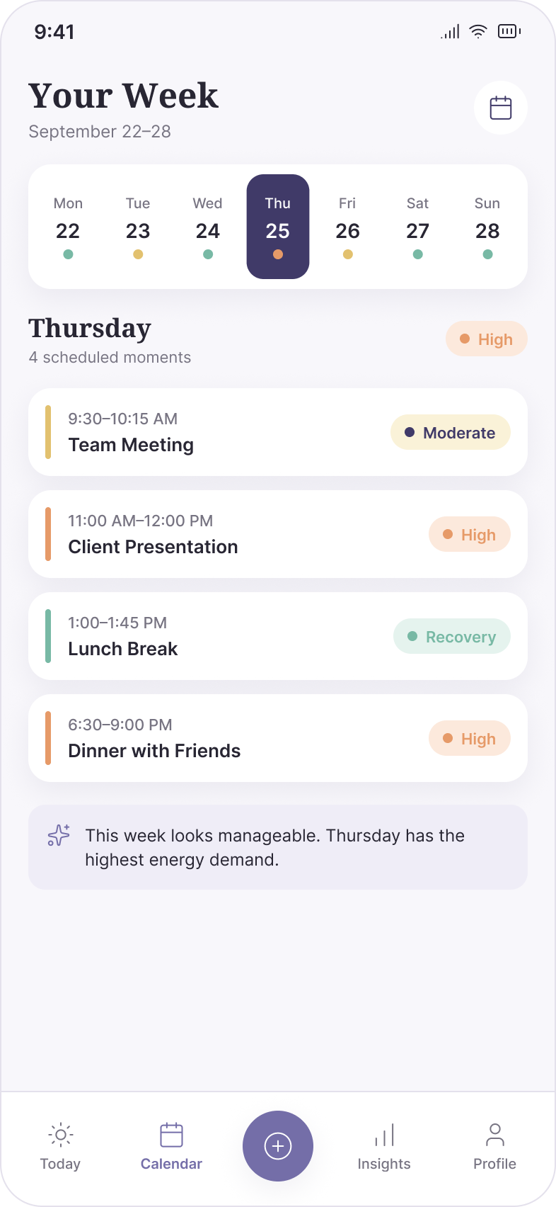
The weekly view expands the same energy language across several days. Small color signals make high-demand days visible without requiring users to inspect every event individually.
Design detail Thursday is surfaced as the highest-demand day while the underlying events remain visible. Users can move between the weekly signal and the commitments creating it.
Insights move beyond showing what happened. Tempo identifies recurring pressure, demanding activity types, and recovery habits so users can understand why certain weeks feel harder than others.
Design detail Insights are written as plain-language observations: the busiest day, the most demanding activity, and a helpful recovery habit. This keeps the output actionable instead of presenting another analytics dashboard to decode.